
How to Build a Personal Style Guide for Your Instagram Brand
Why an Instagram Brand Style Guide Matters
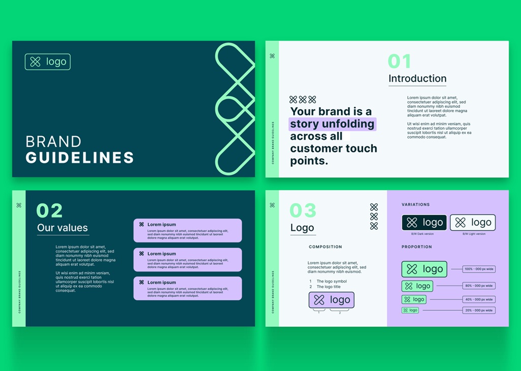
An account can post great content and still look inconsistent. One week the colors feel bright and playful. The next week everything turns moody and dark. That inconsistency confuses an audience, even if each individual post looks fine on its own. An Instagram brand style guide solves this problem directly. It sets clear rules for color, typography, and tone before you post. Those rules don’t limit creativity. Instead, they give creativity a consistent frame to work within. Advanced accounts, especially ones working with multiple contributors, benefit the most from this structure. Without it, every new post becomes a fresh decision. With it, most of the guesswork disappears, and each post reinforces the same recognizable identity. Building this kind of document early tends to pay off many times over as an account continues to grow.
Defining Your Visual Identity From Day One
Defining your visual identity early prevents a messy rebrand later. Many accounts start posting before they’ve settled on a look. That’s fine for the first few weeks. But once an audience starts forming around a certain aesthetic, changing course gets expensive. Followers notice sudden shifts, and not always in a good way. Building your visual identity from the start means fewer awkward transitions down the road. It doesn’t have to be perfect immediately. It just needs enough structure to guide your first fifty or so posts. That early consistency compounds, making your account instantly recognizable well before it reaches a large following. Waiting too long to make these decisions often means unwinding habits that have already taken hold.
Consistency as a Growth Lever
Consistency isn’t just an aesthetic preference. It’s a genuine growth tool. A recognizable visual identity helps your content stand out in a crowded feed. When someone scrolls quickly, a consistent style catches the eye before the brain even processes the content. That split-second recognition builds familiarity over time. Familiarity, in turn, builds trust. Accounts with a strong visual identity often see higher save and share rates, since the content feels more polished and intentional. This isn’t about perfection. It’s about repetition, applied deliberately across every post, so the audience always knows exactly whose content they’re looking at. A well-documented Instagram brand style guide makes that repetition far easier to maintain, even when the person behind the account changes over time.
Defining Your Visual Identity
Defining your visual identity starts with a few foundational choices. What mood should the account convey? Warm and approachable, or sleek and minimal? What colors, fonts, and imagery support that mood? These choices should connect back to the account’s purpose and audience. A fitness account aimed at beginners might lean toward bright, energetic visuals. A luxury travel account might lean toward muted, refined tones instead. Neither choice is inherently better. What matters is that the choice aligns with the brand and stays consistent across every single post that goes out. Writing these early decisions down in an Instagram brand style guide keeps the whole team working from the same reference point. Revisiting these foundational choices once a year is usually enough to confirm they still feel right.
Choosing a Color Palette
A color palette anchors the entire visual identity. Most style guides work well with three to five core colors. One or two should serve as primary colors, used most often. The rest work as accents, appearing in smaller doses. Write down the exact hex codes for each color. This prevents slight variations from creeping in over time, especially when multiple people are editing content. Test the palette across different post types, including Reels covers, Carousel slides, and single images. A palette that works beautifully in one format sometimes clashes in another, so it’s worth checking early rather than discovering the problem later. A quick side-by-side comparison of past posts can reveal these mismatches before they become a recurring pattern. Screen-shotting a full grid view once a month is a simple way to catch anything that feels off.
Selecting Fonts and Typography
Typography often gets less attention than color, but it matters just as much. Choose one or two fonts for text overlays, Carousel slides, and graphics. Stick to fonts that stay legible at small sizes, since most viewers see your content on a phone screen. Pair a bold display font for headlines with a simpler font for body text. Document the exact font names, weights, and sizes in your style guide. This level of detail might feel excessive at first. In practice, it saves enormous time whenever new content needs to be produced quickly and still needs to look consistent with everything that came before it. A quick reference sheet with sample text in each approved font removes any ambiguity for whoever is designing the next post. Keeping that sheet updated as fonts change is a small task worth prioritizing.
Documenting Your Photography and Editing Style
Photography style is often the hardest element to standardize. Lighting, angles, and composition vary from shoot to shoot. Written guidelines help, but visual examples help even more. Include a handful of reference images in your style guide that represent the ideal look. Note details like preferred lighting conditions, camera angles, and background choices. If your account features people, note posing preferences too. This documentation becomes especially valuable once someone other than you is capturing content, since it removes the guesswork around what the final image should ultimately look like. Even a short annotated example, showing what to do and what to avoid, communicates far more than a paragraph of written description alone. Keep these examples updated as your style continues to develop.
Setting Filter and Editing Rules
Editing consistency is easier to standardize than photography itself. Choose a consistent editing approach, whether that’s a preset, a specific app, or a manual process you repeat each time. Document exact settings for brightness, contrast, saturation, and warmth. If you use presets, note the exact preset name and any adjustments you typically make on top of it. This turns editing from a creative guessing game into a repeatable process. New content, even shot in different lighting, ends up looking cohesive once it passes through the same consistent editing rules every single time. Saving a reference image alongside the settings gives future editors a visual target to match, not just a list of numbers. A short checklist alongside the settings makes the process even faster to follow.
Keeping Your Brand Consistent at Scale Through Editing
Keeping your brand consistent at scale through editing becomes essential once content volume increases. A single creator can rely on memory and instinct. A team producing dozens of posts a month cannot. Written editing rules remove ambiguity for every contributor involved. They also make it easier to spot inconsistencies before a post goes live, since deviations become obvious against a documented standard. Reviewing a batch of recent posts against the written rules once a month is a simple habit that catches drift early, before it becomes a noticeable pattern across the entire feed. This kind of routine check tends to matter more as posting frequency increases. It takes little time but pays off considerably.
Keeping Your Brand Consistent at Scale
Keeping your brand consistent at scale requires more structure than a solo account typically needs. As posting volume grows, so does the risk of small inconsistencies slipping through. A style guide becomes the single source of truth everyone can reference. It should live somewhere easy to access, whether that’s a shared document or a dedicated folder. Update it whenever a meaningful decision gets made, such as a new color addition or a shift in tone. Treating the guide as a living document, rather than a one-time task, keeps it useful as the account continues to grow and evolve. A quick monthly check-in helps confirm the document still matches what’s actually being published. Assigning one person to own these updates keeps the responsibility from falling through the cracks.
Building Templates for Recurring Content
Templates save enormous time once an account settles into a rhythm. Create reusable layouts for recurring content types, such as weekly tips, quote graphics, or product features. Templates enforce consistency automatically, since the structure is already built in. They also speed up production significantly, letting you focus more energy on the message rather than rebuilding a layout from scratch each time. Store templates in an easily accessible location alongside the rest of your style guide. Update them occasionally to keep the account feeling fresh, but avoid changing the core structure too often, since frequent changes undermine the consistency templates are meant to provide. A well-organized template library often becomes one of the most-used parts of an entire Instagram brand style guide, saving real time on weeks when the content calendar gets especially busy.
Onboarding Collaborators and Team Members
A style guide becomes especially valuable when someone new joins the account. Instead of explaining the brand from scratch through scattered conversations, hand them the guide directly. It answers most of their early questions immediately. Include practical examples alongside the rules themselves, since examples clarify intent faster than written instructions alone. Ask new collaborators to review a handful of past posts against the guide before creating anything original. This exercise builds familiarity quickly and reduces the number of revisions needed once real content production actually begins. A clear document often does more to onboard a new contributor than a lengthy conversation ever could, and it leaves far less room for miscommunication once real work begins.
Maintaining and Evolving the Guide
A style guide isn’t meant to stay frozen forever. Brands evolve, and the guide should evolve along with them. Revisit it every few months to check whether it still reflects the account accurately. Look at recent top-performing posts and see whether they align with the documented rules. If they consistently diverge in a positive direction, that might signal the guide itself needs an update. Treating the document as flexible, rather than fixed, keeps it genuinely useful instead of becoming an outdated reference nobody actually follows anymore. Every strong Instagram brand style guide reflects the account as it actually exists today, not as it looked a year earlier. A short note on what changed and why keeps that history easy to trace later.
Defining Your Visual Identity as You Grow
Defining your visual identity as you grow means allowing gradual refinement without losing what made the account recognizable in the first place. A slightly updated color palette or a new photography angle can feel fresh without alienating an existing audience. The key is making changes incrementally rather than all at once. A sudden, drastic rebrand risks confusing longtime followers who built loyalty around the original look. Small, deliberate updates let an identity mature naturally, the same way a person’s style might shift slowly over the years without ever becoming unrecognizable. Documenting each small change as it happens keeps the guide accurate instead of quietly falling out of date. This habit costs little effort but pays off enormously later.
Keeping Your Brand Consistent at Scale Over Time
Keeping your brand consistent at scale over time is an ongoing discipline, not a one-time achievement. As new team members join and new formats emerge, small deviations naturally creep in. Scheduling a quarterly review keeps the guide aligned with what’s actually being published. During that review, compare recent content against the documented standards and note any drift. An Instagram brand style guide that gets revisited regularly stays genuinely useful, while one that gets written once and forgotten slowly loses its value as the account and its content continue to change. That regular maintenance is often what separates a document people actually use from one that quietly gathers dust in a shared folder no one opens anymore.
Contact VerifiedBlu to talk about how we can help you grow your Instagram followers organically and authentically.
